
If you've done any visual work, you probably already know that colors vary wildly between real life, digital, and print. While it's tough to do anything about loss of accuracy from the real world to raw data, we can control and standardize the information on our end. Aiming for color correctness is the first step to delivering a consistent experience on both digital and print mediums.
Disclaimer
I am, at best, an amateur visual designer and artist. I aim for professional level quality in all my work, but I can't confidently say that I am any more an authority on color standardization and calibration than the next guy on Google. Fortunately, you don't have to take my word (or theirs): this information is publicly accessible, well-documented, and the crux of the issue—calibration—is done entirely by a very smart program.
Why calibrate?
Proper calibration adheres to a standard laid out by the International Color Consortium, or ICC. This standard aims to deliver a seamless experience between devices and documents, and its adoption is a big reason why most professional print and digital work is so consistent. The failure to adopt this standard is what generally leads to the disconnect between what you see online and what you get in the mail (among other, potentially malicious, reasons).
If you've ever hand-calibrated any devices, throw it out immediately: not only is it likely to be even more inaccurate than the stock device, it's biasing your vision against properly calibrated displays. Your eyes are very good at adjusting to different lighting conditions, including the skewed hues of a flawed calibration.
Calibration will never be 100% accurate, due to external factors such as ambient lighting and device inaccuracies, but reducing the noise goes a long way towards delivering your intended vision.
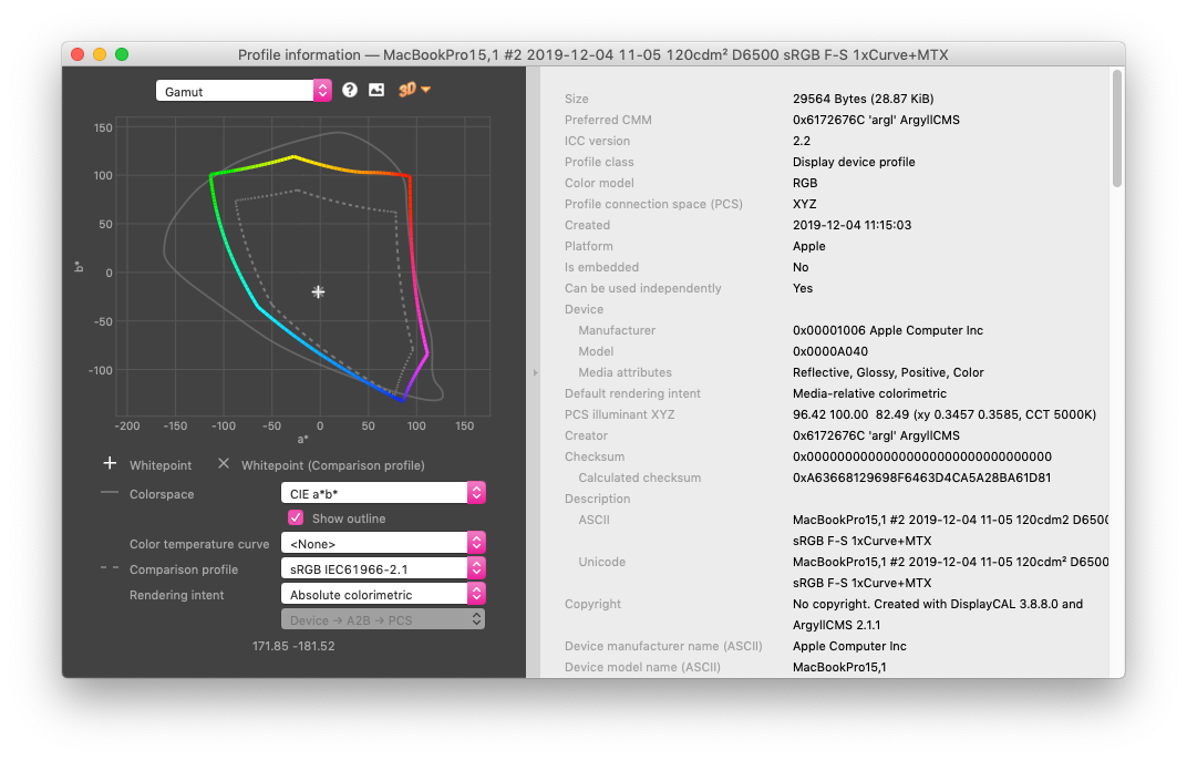
The sRGB Gamut
sRGB (standard Red Green Blue) is the color space standard initially created by HP and Microsoft in 1996 and standardized in 1999. It is by far the most widely used standard on the Internet, and the vast majority of screens can only display sRGB accurately. sRGB is a relatively small portion of the overall visible spectrum (handily defined by a separate color space), and even in 2019 most monitors can't fully display the entire gamut. If unsure, target sRGB—nearly everything in the world does, and devices with wide-gamut capabilities will have no problems, unlike the opposite.
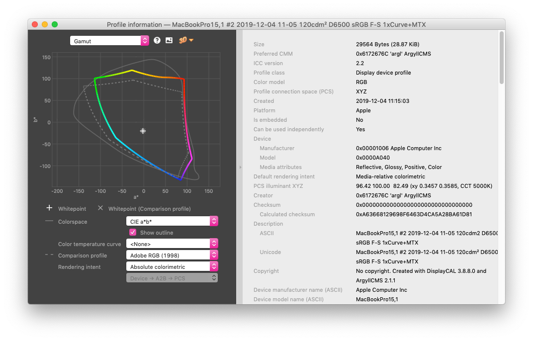
Adobe RGB
The other notable color space developed by Adobe in 1998, it covers a wider portion of the visible spectrum, primarily expanding on the cyan-green hues. Adobe RGB covers the entirety of the sRGB gamut, but relatively few monitors can accurately display Adobe RGB (and those that do are typically more expensive than their sRGB sisters). Many professional print shops try to cover the Adobe RGB color space, though many physical factors limit their ability to fully encompass the color space. This is typically found as a color space option on cameras and in Adobe editing software. Adobe RGB can be spectacularly inaccurate if not handled correctly (as in many sRGB devices). If you have to ask, you probably want sRGB.
Software Calibration
To begin, you'll want to buy a colorimeter, such as those from X-Rite or Datacolor. This is completely up to you, but anecdotally, I have had much better results using an X-Rite i1 Display Pro than a Datacolor Spyder5Express. You may find it worth your while to do the purchasing research yourself, especially as they aren't cheap, but better to make a bigger early investment if you have the choice (though both are far better than out-of-box calibrations).
You'll also want to just throw out the bundled software, which is apparently the only difference between Spyder5Elite and Spyder5Pro, as they all share the same sensor. I couldn't even get the X-Rite application to work on Windows 10, so it was useless to begin with. Fortunately, a far better open-source alternative exists called DisplayCAL, which utilizes ArgyllCMS under the hood.
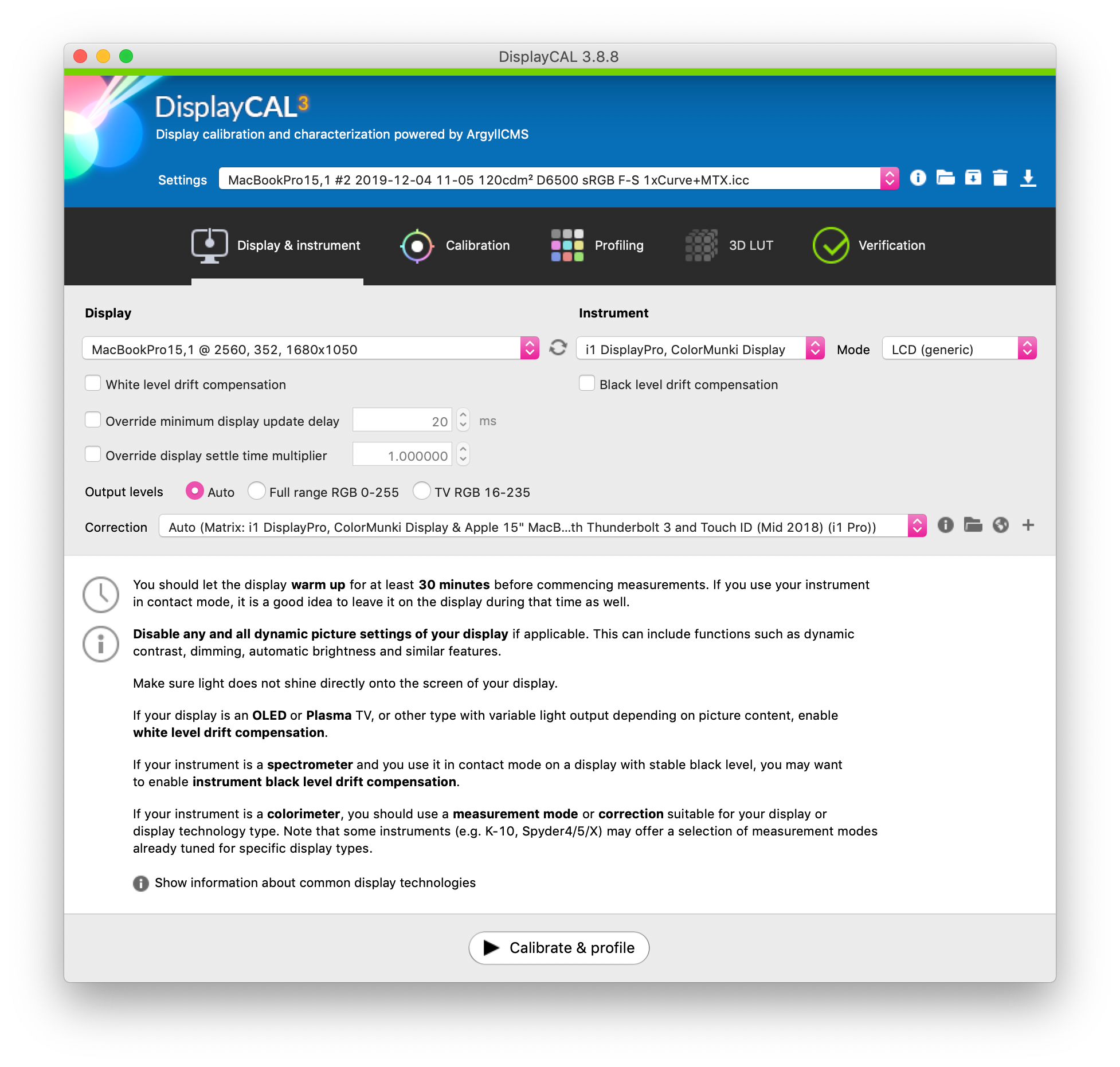
All the options are explained in great detail starting from here, but generally, the defaults will work fine. They can definitely be somewhat confusing though, especially if you're not a color scientist. If you decide to go ahead with DisplayCAL, note that the following settings are shown only when you have advanced options turned on (Options » Show advanced options).
Initial Settings
This part is fairly self-explanatory. You may have to consult your monitor's manual if you're unsure about the device mode, though "LCD (generic)" or "White LCD" are safe bets. If you want, you can import a correction for your colorimeter and monitor combination.
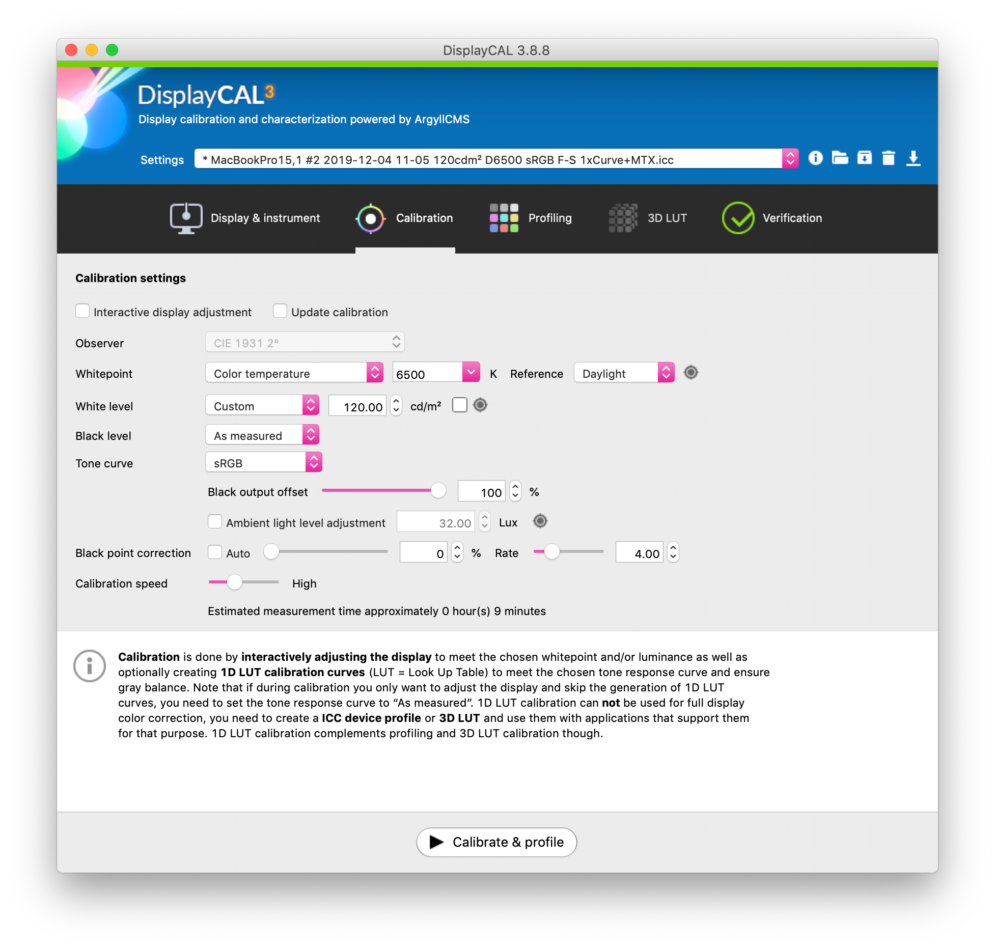
Calibration Settings
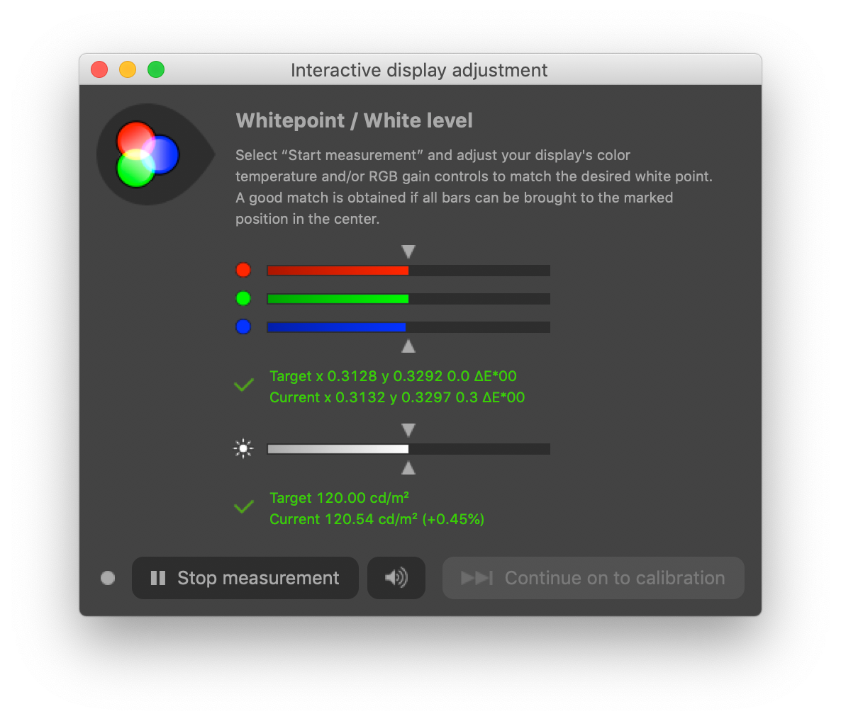
This can be pretty in-depth and intimidating, though the defaults aren't too shabby. If you're working with a monitor you can adjust (pretty much all external monitors, including tablet monitors), you can set "Interactive display adjustment", which allows you to equalize RGB gain and brightness before committing to the calibration. You typically do this via an OSD, but consult your manual or Google.
If you're targeting print, you'll most likely want to change the whitepoint to match interior lighting at D50 or D55. Otherwise, D65 is the standard whitepoint for digital mediums. If you leave this at default (As measured), DisplayCAL will use your native whitepoint.
White level is the target brightness, though it can reportedly lead to odd behavior on certain devices when approaching their absolute white level. I find the default white level to be suitable for general purposes.
Black level is used for the target brightness of black, and is used primarily to match native blacks across different devics.
Tone curve should be set to sRGB to closely match the ideal sRGB response curve, unless you really know what you're doing. sRGB has an approximate gamma of 2.2, which is standard for digital mediums. There's also the option to adjust for ambient lighting, which I find to be quite unhelpful in day-to-day usage, though I'm sure there are reasons to measure and set this option; probably do not use the default value here, as you're supposed to measure the ambient light level yourself with your chosen device (if it has that functionality).
If you set the tone curve to anything but "As measured", you'll find that you can choose the calibration speed, which will change the overall accuracy of the final profile. I would not go any faster than High, as it can be rather inaccurate and even fail to pass the extended verification test.
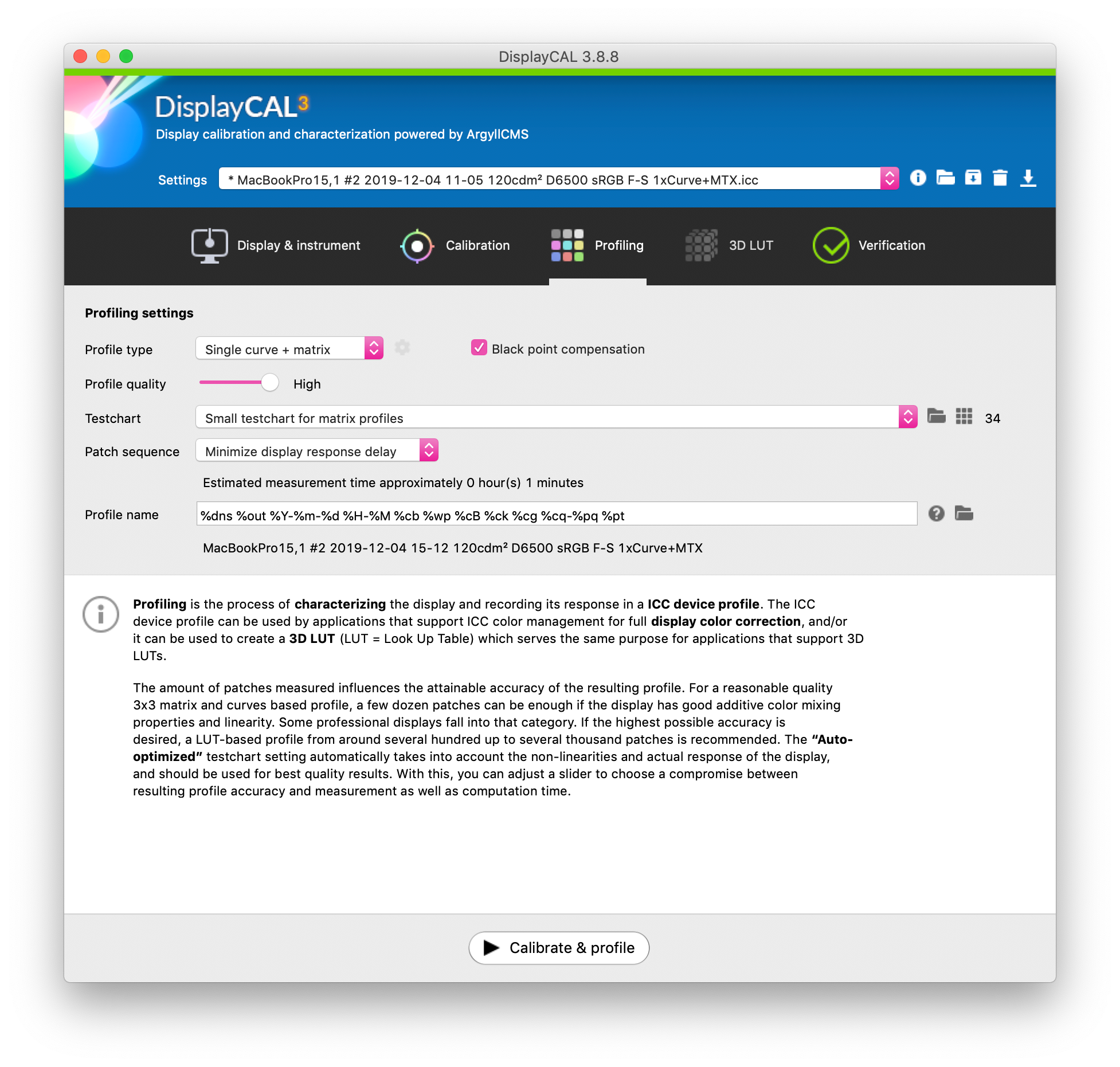
Profiling Settings
The default settings work well for general use, and I generally don't use anything but "Single curve + matrix." 3D LUT profiles are an alternative to ICC profiles.
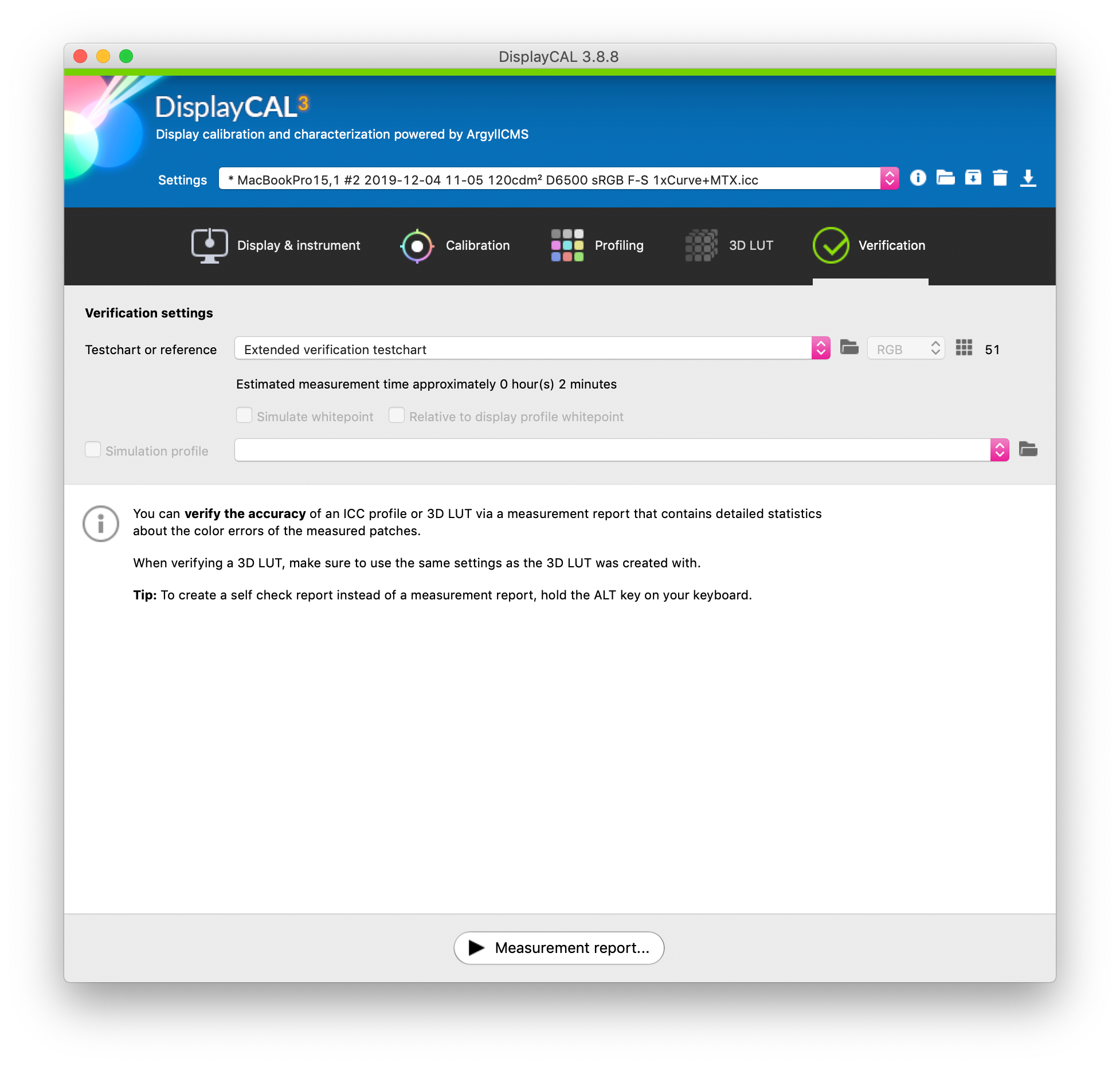
Post-Calibration Verification
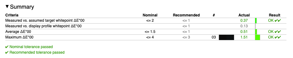
After calibrating, I usually test against the "Extended verification testchart," which contains 51 patches (as noted below). You can test against many different testcharts, but don't be surprised if you fail the more accurate ones—typically that can come down to monitor capabilities and the accuracy of the profile you chose in the calibration settings. More patches means more accuracy at the cost of longer time spent verifying (or calibrating).
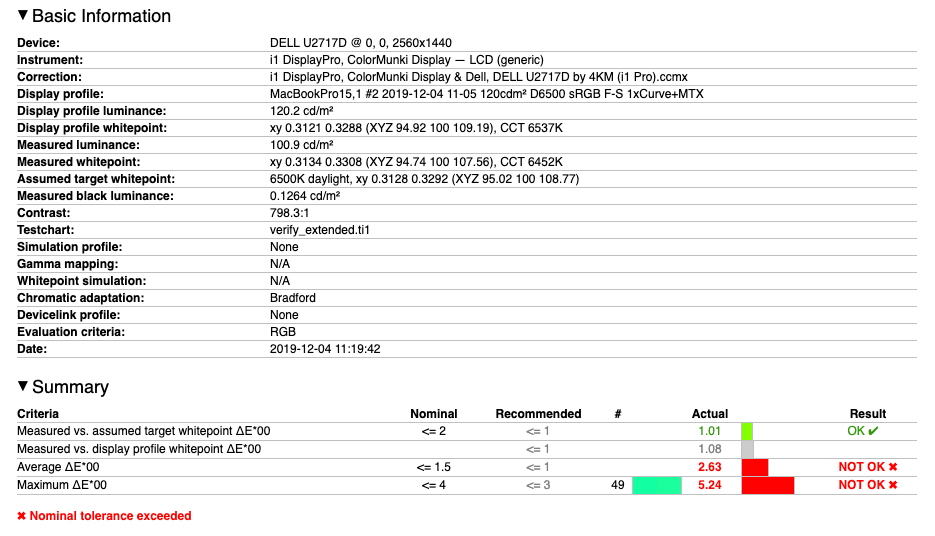
After running a verification test, you'll get a handy HTML report that details how well you compared to the testchart and whether you're within nominal tolerances. Here's a before and after comparison of a Dell IPS monitor I calibrated at work:
Closing
Hopefully this was an insightful look into the importance of color accuracy and methods to properly calibrate your display. Colors are an extremely in-depth topic and I have hardly scratched the surface, but this is what I consider to be fairly good working knowledge for personal use after hours of poring over documents to achieve true color accuracy. As always, best to use your own judgment and avoid blindly following directions, though I've included the sources of information I used where applicable.